Does giving a border to text make it easier to read on Google Slides?
2022-02-25
Google Slides is a fantastic presentation app packed with functions. In fact, it has so many functions it can feel daunting to use at first.Hello again. K-Bo here.
I am K-Bo, a user of Google Slides for more than 5-years, here to solve some issues you might be facing when starting with this app.
Have you ever felt it is impossible to make the text readable when placing the text-box on top of a picture?
Read further to find a way to deal with this issue.
Is text on Google Slides difficult to read?
There are time that text on a slide in Google Slides is difficult to read. There is nothing wrong with Google Slides. This happens when there are a lot of different colors being used behind the text.

For example, it is often difficult to read text that is placed on a picture. The letters just blends in with the picture.
Is there a way to make text easier to read?
There are a few ways to improve the readability of text. One is to color the background of the text-box. Another is to give each letter of the text a border.

I recently noticed that TV programs in Japan use this technique quite often.
How are borders added to the text?
A function in Google Slides called [Word Art] is used. [Word Art] can be found in the menu that pops up once clicking on [Insert] from the menu bar.
![[Insert] menu](https://kenken-alacarte.com/wp-content/uploads/2022/02/Insert-300x164.png)
![[Word Art]](https://kenken-alacarte.com/wp-content/uploads/2022/02/Menu-133x300.png)
Type the message you want to create in the box that pops up.
![[Word Art] text writer](https://kenken-alacarte.com/wp-content/uploads/2022/02/message-window-300x130.png)
The text will appear in white letters with black borders (image below).
![[Word Art] example "Big Wave"](https://kenken-alacarte.com/wp-content/uploads/2022/02/Word-Art-300x132.png)
Is there a way to change the color of the text and border?
To change the color of the borders on each letter, first make sure that the text-box is selected. Click on the [border color] icon that looks like a pen and choose a color of your liking.
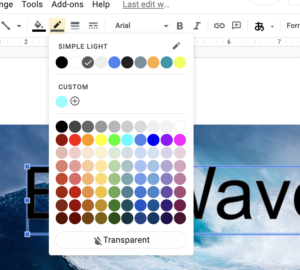
To change the color of the text, click on the [color fill] icon that looks like a tilted bucket and select the color you want the text to be.
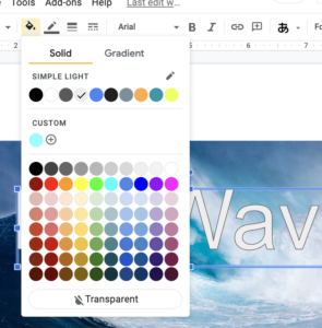
And that is it.

What’s to be done when it is still difficult to read after giving the text a border?
The text can sometimes be difficult to read if the borders are too narrow.
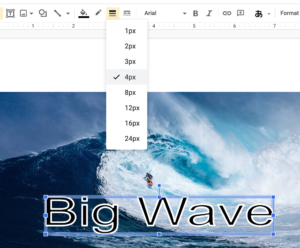
Click on the [border weight] icon that looks like a bunch of lines and choose a border width that you are happy with.
Before I go…
In some situations, coloring the background of the text-box is very useful. In others, giving an outline to individual letters is better. Choose the better solution to make your presentations inspiring and interesting.
If you need to learn about outlining text on Apple Keynote and creating outlines on text in Microsoft PowerPoint, please check out my other articles.
Posted by K-Bo
Related Posts

Can text-boxes have translucent backgrounds on Microsoft’s PowerPoint?
Do you know how to color the background ...

Does giving boarders to each letter of text make it easier to read on Apple’s Keynote?
Text can blend in and be difficult to re ...

Can text-boxes have translucent backgrounds on Apple’s Keynote?
Do you know how to color the background ...

Can text-boxes have translucent backgrounds on Google Slides?
Do you know how to color the background ...

The first thing to do in a new class on Google Classroom is to set up Grading
Did you know that the first thing you sh ...


Discussion
New Comments
No comments yet. Be the first one!