What happens when you overlap translucent objects on Apple’s Keynote?
Apple Keynote is a fantastic presentation app packed with functions. In fact, it has so many functions it can feel daunting to use at first.
I am K-Bo, a user of Apple Keynote for more than 10-years, here to solve some issues you might be facing when starting with this app.
Translucent objects are useful when you need to place shapes on pictures and text.
Have you noticed that the opacity is displayed in percentages? Have you ever thought of what this percentage means?
How do you change the opacity level of objects on Apple’s Keynote?
To change the opacity level of objects on Keynote, select the object by clicking on it.
Click [Format] and find [Opacity] under [Style]. Use the slide bar to change the opacity.
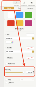
Opacity 100% means you can’t see underneath, right?
When placing an object on a slide, the opacity level is at 100%. This is why you can’t see behind the object.
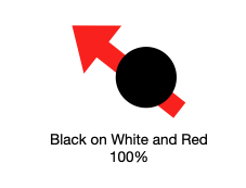
If you can’t see behind a single objet which the opacity level is at 100%, does it mean you can’t see behind multiple objects if the total opacity is at 100%?
If not, what percent does it need to be to completely hide the object at the bottom of the object pile?
Method of experiment
A basic Keynote presentation with a black background was prepared. White and blue objects were placed on the slide. Blue was the darkest shade in the basic color palette (image below).
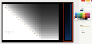
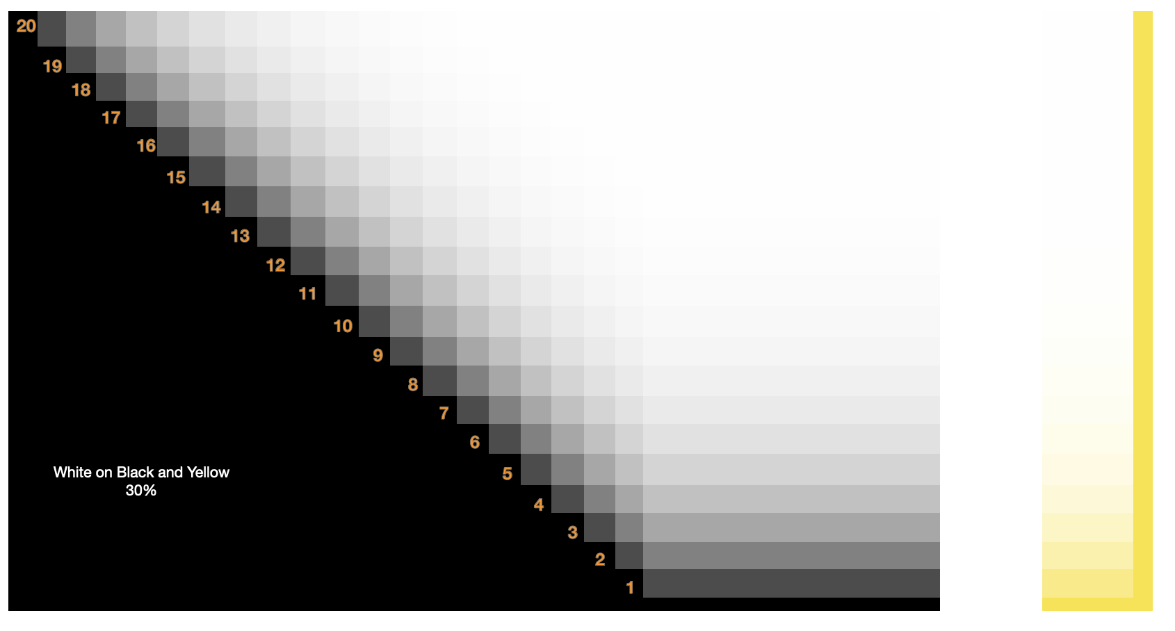
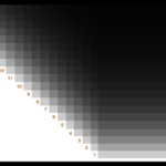
20 black translucent objects were placed on top of the white and blue objects as can be seen in the image below.
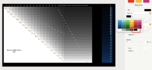
The opacity of all the numbered objects were matched. The opacity was changed in 10% increments starting at 10%. This means if the opacity was set for 20%, all 20 of the black objects overlapping the white and blue objects were set this way. I checked how many layers of translucent black objects it took for the white and blue objects to become unseeable.
This experiment was conducted on a 2021 iMac with an M1 chip.
I did this experiment alone, so this is a personal observation and nothing scientifically conclusive.
Experiment!
I will present the slides starting from 10% opacity up to 90%.
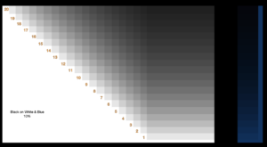
At opacity 10%, I could see both white and blue under all 20 layers.
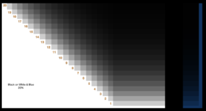
At 20%, it was difficult to identify layer 16, but not impossible. I felt layer 17 was completely black.
It was difficult to see blue from layer 11 and higher.
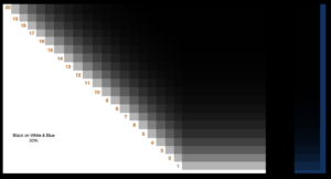
At 30%, I could identify the white object up until the 11th layer, but not 12.
It was impossible to see blue from layer number 8.
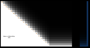
At 40%, white was visible until the 7th layer but layer 8 was completely black.
It was black from layer 5 on blue.
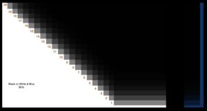
At 50%, it was pitch black from layer number 6.
Blue was visible until layer 3.
At 60% white was visible until layer 5 and 2 for blue.
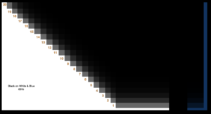
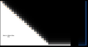
Below are images for opacity levels 70%, 80% and 90%.
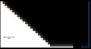
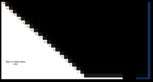
At 90%, you could not see white or blue after the 2nd layer.
Conclusion
As described above, I overlayed 20 black objects and adjusted the opacity at 10% increments starting from 10% and placed them on white and blue objects.
It can be assumed from the findings that you need a total of 300% opacity to completely hide white objects with black ones when using translucent objects.
For blue, the needed total opacity percentage seems to be 200%.
90% did not fit this assumption. It was impossible to see under 2 layers of objects that have opacity of 90%.
Before I go…
I’m guessing not many people would actually pile 20 layers of objects when creating a slide. The percentage slide bar caught my attention and I became curious of what the percentage might mean. I hope this entry is useful for someone out there.
I am thinking of doing a similar experiment with bright colors on dark.




Discussion
New Comments
No comments yet. Be the first one!