Does giving boarders to each letter of text make it easier to read on Apple’s Keynote?
Apple Keynote is a fantastic presentation app packed with functions. In fact, it has so many functions it can feel daunting to use at first.
I am K-Bo, a user of Apple Keynote for more than 10-years, here to solve some issues you might be facing when starting with this app.
Have you ever felt it is impossible to make the text readable when placing the text-box on top of a picture?
Read further to find a way to deal with this issue.
Is text on Apple Keynote difficult to read?
There are times that text on a slide in Keynote is difficult to read. There is nothing wrong with Apple’s Keynote. This tends to happen when there are a lot of different colors being used behind the text.
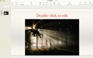
For example, it is often difficult to read text that is placed on a picture. The letters just blends in.
Is there a way to make the text easier to read?
There are a few ways to improve the readability of text. One is to color the background of the text-box. Another is to give each letter of the text a boarder.
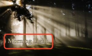
I recently noticed that TV programs in Japan use this technique quite often.
How are outlines added to the text?
You can add boarders to text on Keynote by following these steps. Click on:
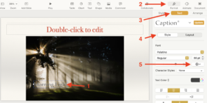
- text-box
- [Format] (the paint brush icon)
- [Text]
- [Style]
- [Open Advanced Options](Gear icon)
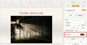
Once the advanced options are open, click on [Outline] ('6’ in picture below).
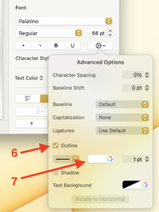
Select a color from the color pallet ('7’ in picture above).

An outline will appear around each letter in the color you chose.
How can the base color of the text be changed?
Color of the text (inside the outline) can be changed by choosing a color from the color panel in the format panel.
Before I go…
In some situations, coloring the background of the text-box is very useful. In others, giving an outline to individual letters is better. Choose the better solution to make your presentations inspiring and interesting.
If you need to learn about outlining text on Microsoft Powerpoint and creating text borders on Google Slides, please check out my other articles.



Discussion
New Comments
No comments yet. Be the first one!